Content of Tab 1 Content of Tab 2 |
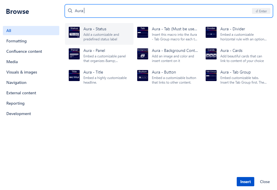
Please follow these steps to insert an Aura - Tab Group & Aura - Tab macro on a Confluence Page:
Go to the Confluence page you wish to edit
Click on the Edit button of the Confluence page or press "E"
In the page editor click on the + button (Insert), and select View more
Select the Aura - Tab Group macro from the provided list and the configuration dialog appears
Configure the Aura - Tab Group as needed and hit the save button of the macro
Now click somewhere inside the Aura - Tab Group so that the cursor appears in it
Click on the + button (Insert), and select View more
Select the Aura - Tab macro from the provided list and the configuration dialog appears
Configure the Aura - Tab as needed and finally hit the save button
Repeat the the last three steps for each further tab that is needed
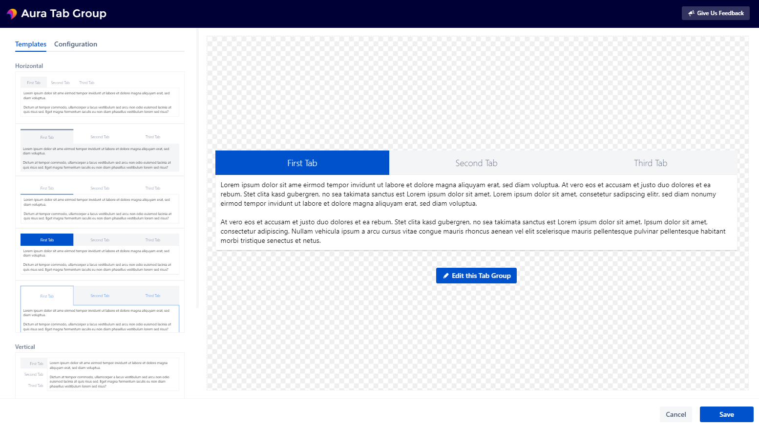
The configuration dialog helps users to create the tabs that suit their needs:
The Aura - Tab Group provides a live preview on the right that shows the result in realtime
The Aura - Tab is a simple form and therefore comes without a live preview
All parameters are optional, customizable by users and explained in detail below.
After the configuration is done click Save and the macro will be visible on your Confluence page. Clicking on Close will abort the configuration and the inserting of the macro.
Choose from different predesigned templates and customize them in the "Configuration" tab to suit your needs.
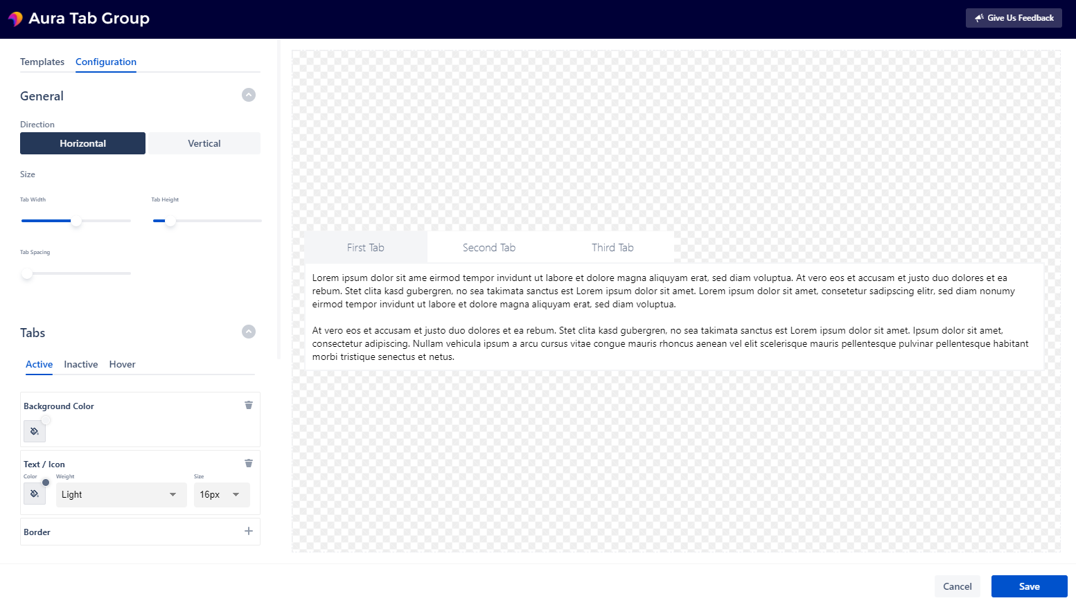
The configuration is separated into five sections:
General
Active Tab
Inactive Tabs
Hover for Inactive Tabs
Content
General
Direction - Choose between horizontal or vertical tabs
Size - Customize the tab size by adjusting the sliders of 'Tab Width', 'Tab Height' and 'Tab Spacing' (not available for vertical tabs)
Active Tab
Background Color - Adjust the background color of the active tab
Border - Choose how the border of the active tab should look like
Text / Icon - Adjust how text & icons should be formatted (that will be inserted later on in the Aura - Tab macro)
Inactive Tabs
Background Color - Adjust the background color of all inactive tabs
Border - Choose how the border of all inactive tabs should look like
Text / Icon - Adjust how text & icons should be formatted (that will be inserted later on in the Aura - Tab macro)
Hover for Inactive Tabs
Background Color - Adjust the background color of the hovered inactive tab
Border - Choose how the border of the hovered inactive tab should look like
Text / Icon - Adjust how text & icons should be formatted (that will be inserted later on in the Aura - Tab macro
Content
Background Color - Adjust the background color of the content box
Border - Choose how the border of the content box should look like
Padding - Choose a suitable padding for your content
Shadow - Choose betwenn several shadows that will be displayed behind the content box
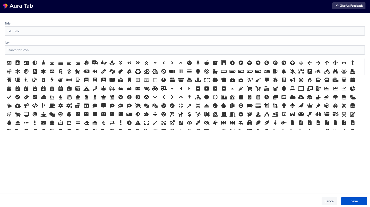
Title - Enter a tab title for the selected tab
Icon - Select an icon for the selected tab (use the icon search to filter all icons)
To deselect an icon, either click the selected icon again or select another icon and deselect it again (this could be faster).
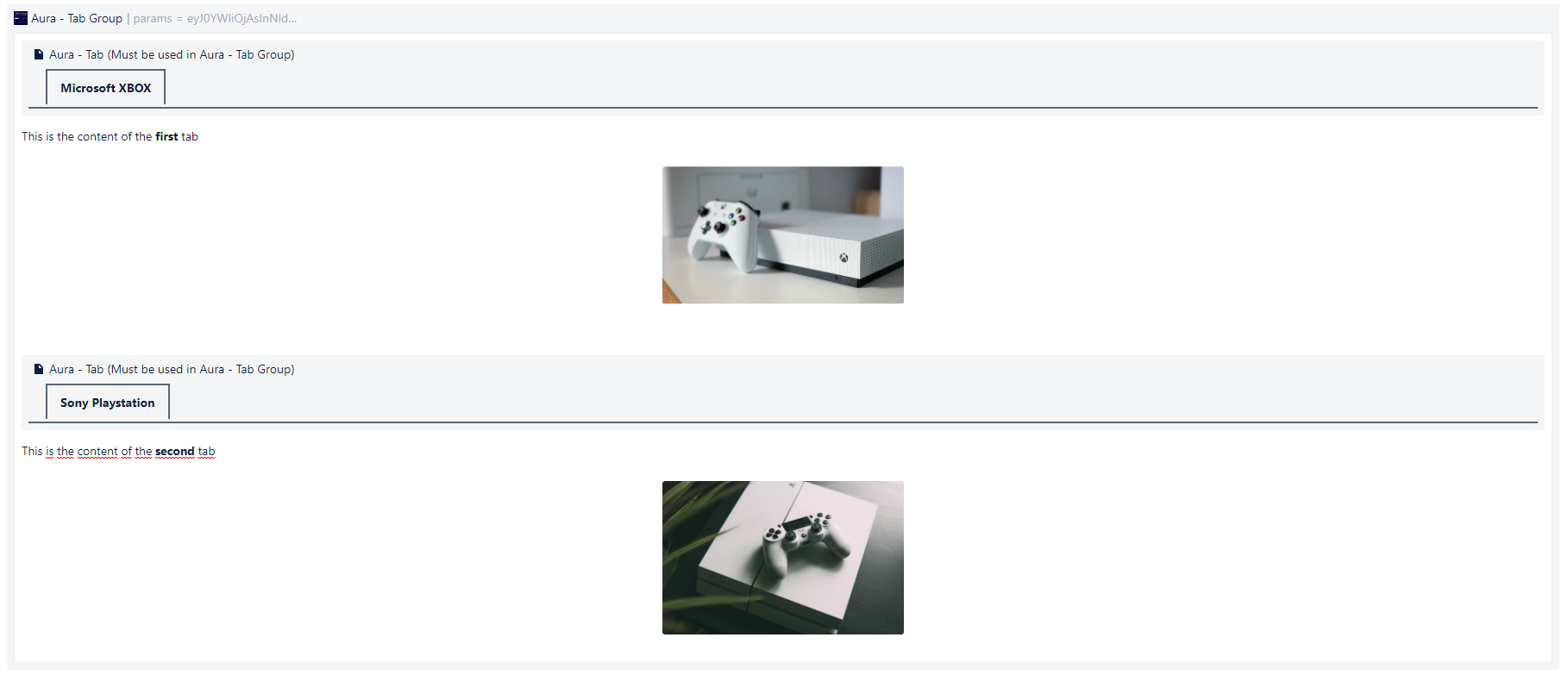
The desired content is inserted under an aura tab as shown in the screenshot. To insert a new and empty line under an Aura-Tab Macro, insert your cursor to the right of the Aura-Tab Macro and press the Enter key.
The aura tabs act as separators and only the content up to the next tab is displayed in the respective tab.

Please follow these steps to edit or remove the Aura macro on a Confluence Page:
Go to the Confluence page you wish to edit
Click on the Edit button of the Confluence page or press E
Click on the Aura macro you wish to edit or remove
A small dialog with the options Edit and Remove appears
Click on the desired action
This table shows which content/macros can be inserted and used inside this Aura macro. Please note that the compatibility may change with each new cloud version that Atlassian releases.
Content | Compatible | Notes |
|---|---|---|
Text & Formatting (color, italic etc.) |
| Empty lines are ignored (by Atlassian and we can not change that) |
Headings |
| |
Bullet List |
| |
Numbered List |
| |
Check List |
| Editing in page view mode is unsupported |
Tables | | Cell color and sorting is unsupported. |
Links |
| Links are displayed in full length |
Images |
| Images can be scaled, but the size differs between Edit and View mode. Image captions won’t show. |
Mentions |
| |
Emojis |
| Most of the emojis are displayed as a blue star. This is a bug that Atlassian has to fix. Here is an incomplete list of working emojis: |
Code snippet |
| Content is visible, but line numbering, color highlighting and copy button are not available. |
Date |
| |
Divider |
| |
Atlassian Panels |
| The design differs in view mode compared to edit mode |
Status |
| The design differs in view mode compared to edit mode |
Quote |
| |
Decision |
| |
Expand |
| |
PDF (directly inserted) |
| |
Macros | Compatible | Notes |
Activity Stream |
| |
Advanced Roadmaps for Jira | not tested | |
Agile Wallboard Gadget | not tested | |
Assigned to Me |
| |
Attachments |
| Versions can not be maximized. Upload drop zone is not working. Uploading through button does not work. |
Aura - Background Content |
| |
Aura - Button |
| |
Aura - Cards |
| |
Aura - Divider |
| |
Aura - Panel |
| |
Aura - Title |
| |
Average Age Chart |
| |
Average Number of Times in Status |
| |
Average Time in Status |
| |
Blog Posts |
| The ‘Create blog post’ button is greyed out and can not be used. |
Change History |
| |
Chart |
| |
Children Display |
| |
Content by Label |
| |
Content Report Table |
| |
Contributors |
| |
Contributors Summary |
| |
Create from Template |
| |
Created vs Resolved Chart |
| |
Days Remaining in Sprint Gadget | not tested | |
Decision report |
| |
Excerpt |
| |
Excerpt Include |
| |
Filter Results |
| |
Gallery |
| |
Heat Map |
| |
Iframe |
| |
Include Page |
| |
Issue Statistics |
| |
Issue in progress |
| |
Jira |
| |
Jira Charts |
| |
Jira Issues Calendar |
| |
Jira Road Map |
| |
Jira roadmap | not tested | |
Labels Gadget |
| |
Labels List |
| |
Livesearch |
| Visuals differ between Edit and View mode. Clicking on the 'Search' button displays the search results and the confluence frame at the top of the opened page. |
Office Excel |
| |
Office Powerpoint |
| |
Office Word |
| |
Opsgenie Incident Timeline | not tested | |
Opsgenie Incident Timeline EU | not tested | |
Page Index |
| |
Page Properties |
| |
Page Properties Report |
| |
Page Tree |
| |
Page Tree Search |
| Clicking on the 'Search' button displays the search results and the confluence frame at the top of the opened page. |
| ||
Pie Chart |
| |
Popular Labels |
| |
Profile Picture |
| |
Projects |
| |
Quick links |
| |
Recently Created Chart |
| |
Recently Updated |
| The Show More button open an ugly list of more recently updated content. |
Recently Updated Dashboard | | The tabs My Spaces & Network can not be opened. |
Related Labels |
| |
Resolution Time |
| |
Roadmap Planner |
| |
Shared Links Bookmarklet Button |
| |
Spaces List | | The tab Favourite can not be opened. |
Sprint Burndown Gadget |
| |
Sprint Health Gadget |
| |
Starred filters |
| |
Table of Content Zone |
| |
Table of Contents |
| |
Task report |
| |
Time Since Chart |
| |
Time to First Response |
| |
Trello Board |
| Seems to work |
Trello Card |
| Seems to work |
Two Dimensional Filter Statistics |
| |
User List |
| |
User Profile |
| |
Version Report |
| |
Voted Issues |
| |
Wallboard Spacer Gadget | not tested | |
Watched Issues |
| |
Widget Connector (YouTube Videos etc.) |
| |
Workload Pie Chart |
|